Artist's Back to Basics

Brush Article 15

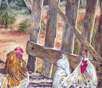
Gradations of colour and tone pretty much occur everywhere. I’ve probably said this about six squillion times. My arts practise is fundamentally built on gradations of colour. Often the painting itself will be entirely a series of gradations of colour, with some detail applied for realism.

Some gradations are quite obvious, and some are subtle. Even within the most subtle gradation of colour, there is a whole world of nuance. They are rarely just gradations in tone. There is usually a shift in hue as well. And often, several.

Throughout history, artists have been mesmerised by the illusion of dimension, particularly in figures and fabric. Being able to “gradate” colour and/or tone is necessary for this. You may not wish to paint “realistically”, but knowing the process and the “rules” around this process will allow you to expand your creativity. By this I mean you

You’re reading a preview, subscribe to read more.

More from Artist's Back to Basics

Artist's Back to Basics5 min read
Making A Good Impression
Keep a wooden ruler next to your easel to rap yourself over the knuckles with, if you have any thoughts about overworking an impressionistic painting. Its whole appeal is in its freshness. Here I have used this impressionistic watercolour painting ‘’
Artist's Back to Basics5 min readVisual Arts
The People’s Choice
Art has always been a part of my life. In my childhood, living in Wiltshire, an English rural county, I drew horses and animals, inspired by the countryside and the many books that I was always reading. As an adolescent and teen I progressed into dra
Artist's Back to Basics6 min read
Woburn Abbey’s Fiery Passion
Establish the composition: It’s important to me that I catch and retain the viewer’s eye in my paintings with a strong composition. I must consider the importance of my focal point, my clear and concise light source, directional lines, depth, contras

Related