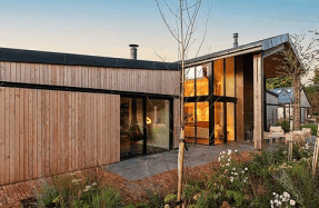
Contrasting extensions

People used to feel that extensions should, as closely as possible, match the building they were being added to. While this undoubtedly produces some seamless and sympathetic additions, it can also create spectacularly bad results.
The worst ‘matching’ extensions feature ugly seams between old and new, materials that almost, but don’t quite, look the same and rooflines that sit awkwardly together.
In many cases it is a far better idea to design the extension to sit in complete contrast to the original house in order that both sections can shine in equal measure. There is no reason why a contrasting extension has to be whacky or ‘out there’ either. Sometimes, just a selection of different materials or a shift in the shapes and forms used in the design are